
How Are Book Covers Made?
Behind the scenes in the making of the book cover for my new novel 'The Heirs'

Hello friends!
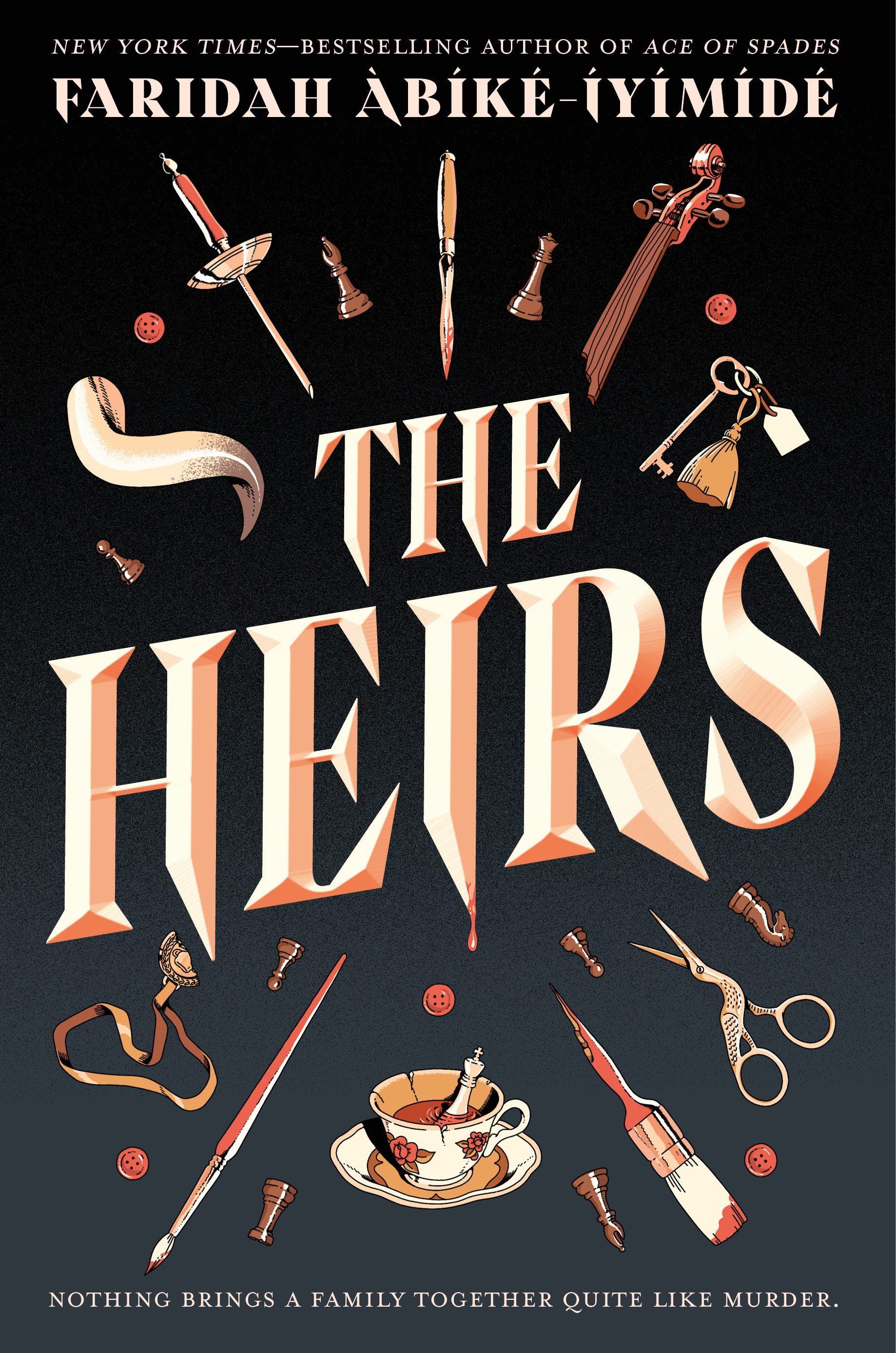
Earlier this month I had the immense privilege of having Cosmopolitan Magazine reveal the U.S. cover for my next book The Heirs! If you haven’t yet seen this stunning cover, here it is below:
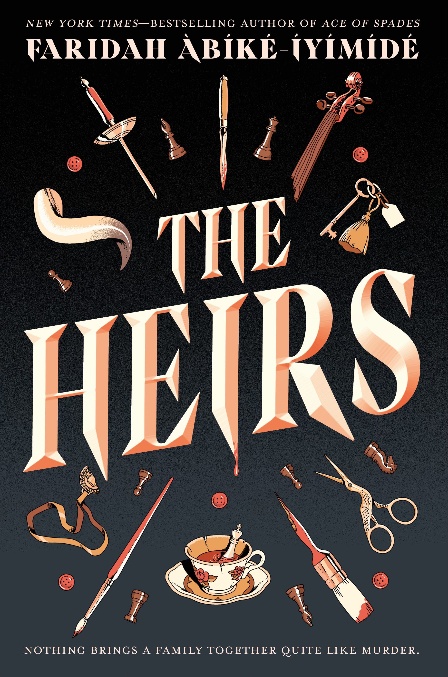
Illustrated by ChooDraws / Designed by Megan Sayre
Any followers of my newsletter this past year will have already seen me drop several hints about this book, which I have previously referred to as BUTTON BOOK, and I am so pleased to finally be able to speak about it! (without the fear of getting into trouble with my publishers).
Today’s post will be about the exciting and often turbulent behind the scenes process of making a book cover. I will be showing you the early sketches and the many, many alternate covers on the road to landing on this one.
As you can probably guess, a lot goes into creating a book cover. Contrary to popular belief, most traditionally published authors have very little say in what their book covers look like, in fact, I have met many authors who either dislike their covers or feel quite meh about them in general. This is because when it comes to creating a book cover, the thing that matters most is not what the author deems to be aesthetically pleasing, but more so what the reader and the bookshops will be most drawn to. Sometimes what is effective in the market is not necessarily representative of the author’s own personal artistic tastes. All of that being said, I have had the rare privilege of being very involved in my own book cover process. I get to help choose the artist, which is my favourite part as I am a huge fan of many artists and so often get to work with some of my favourite illustrators, and I’m also involved in every step from the initial sketch phase all the way up to the final cover stage.
Initial Sketches
In the first round of initial sketches, the artist Choo sent across a variety of different compositions and styles, all of which adhered to the brief of having motifs / symbols that would represent the main characters (The Button Heirs). This first round involved ten different cover sketches.
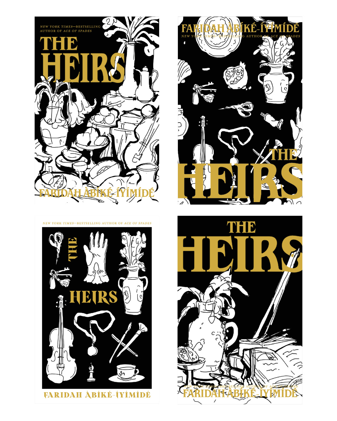
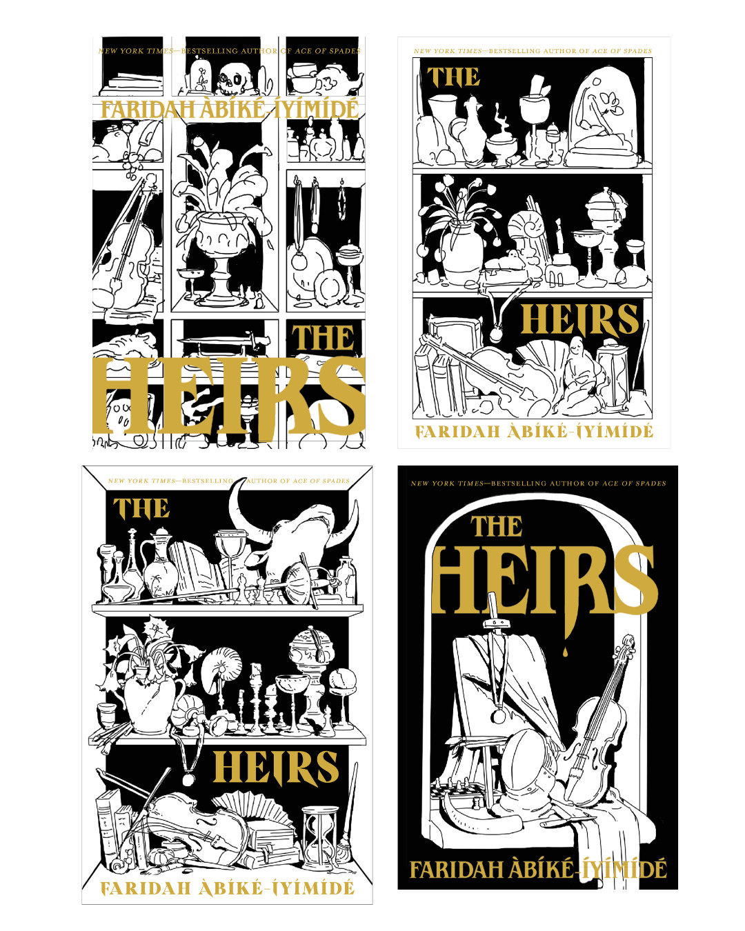
While the sketches were great, none of them quite matched the exact vibe of the story. I looked over the sketches and picked out the things I thought worked most in them and found that there was a through line. The sketches that had the motifs / symbols more distinctly placed, such as the 3rd sketch and the 9th and 10th sketches, felt more aligned with The Heirs. With this feedback, Choo and Megan went back to the drawing board.
Refining and Playing Around with Motifs and Concepts
The next stage of the sketching process was a lot more focused now that we had an idea of the sort of direction we were going down for the cover. In this stage the artist Choo and the designer Megan focused a lot more on the individual items that would act as representations for the main characters and key themes. We wanted to avoid centring one character too prominently over the others, while also ensuring that the illustrated symbols were strong and balanced. There is also the matter of the title. In my opinion a really strong cover is one where the title is prominent. This does not always mean the title needs to be large and bold, more so that it does not get lost in the art itself. Titles are just as important as the art itself, each component sells the other and so neither can be sacrificed for the other.
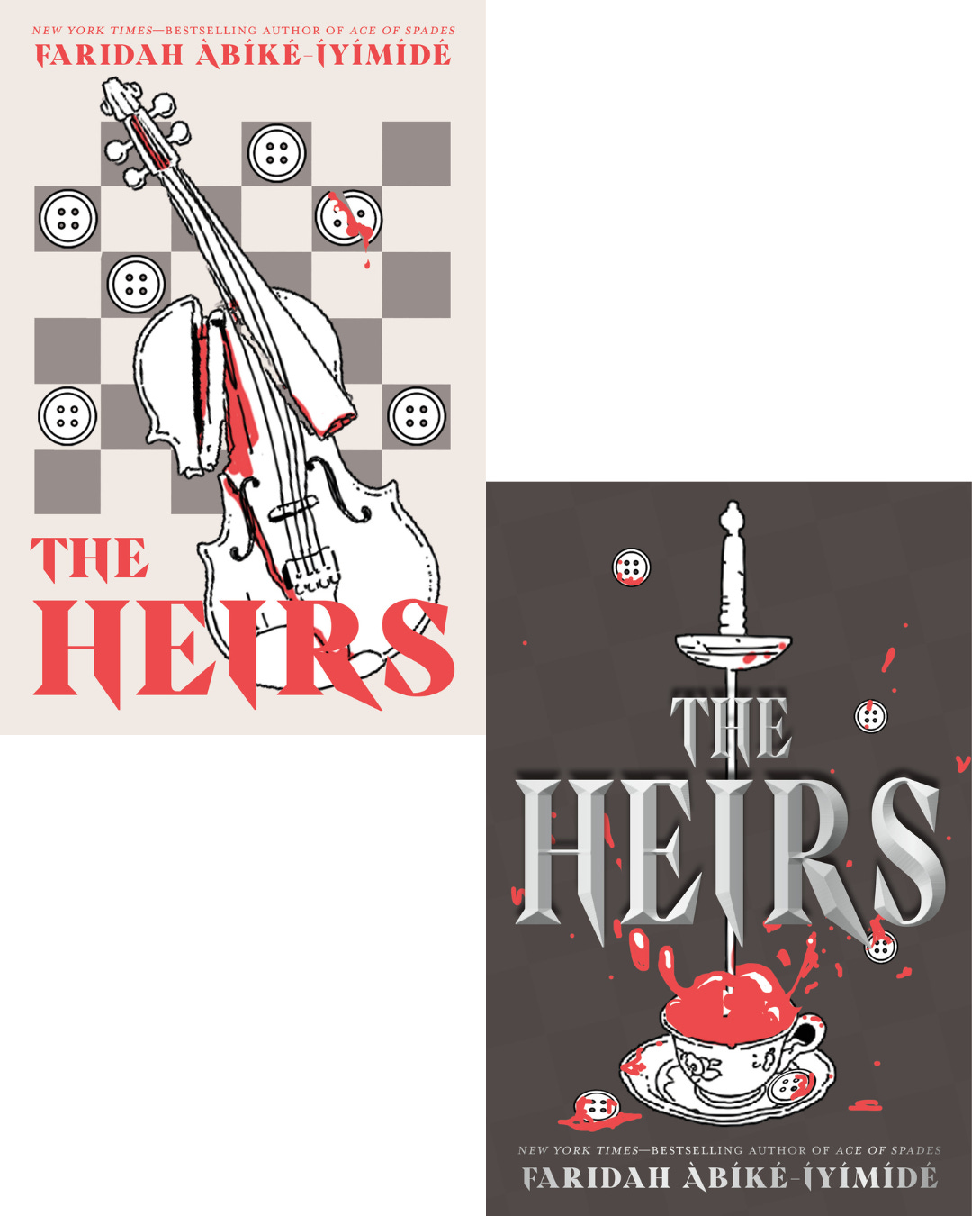
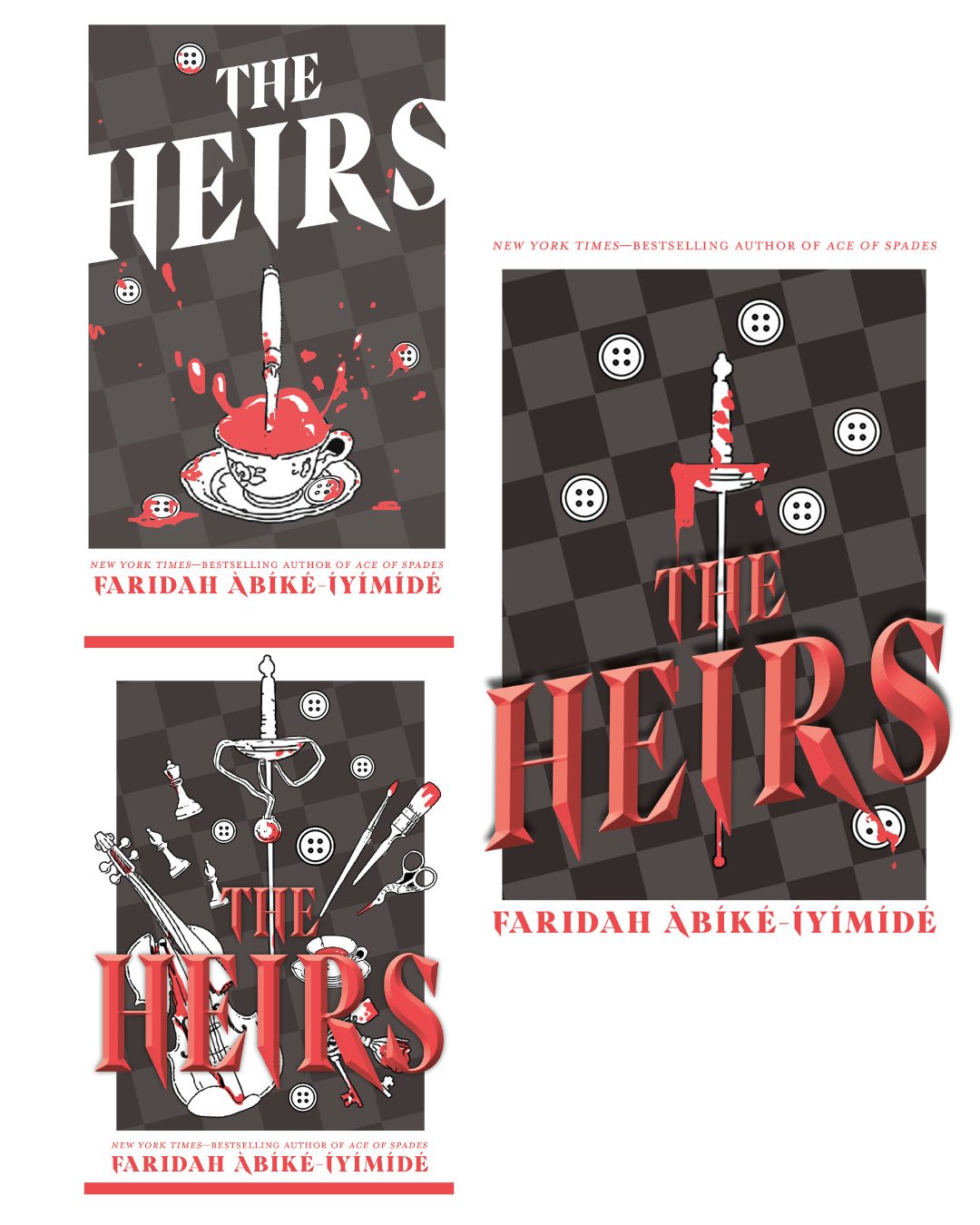
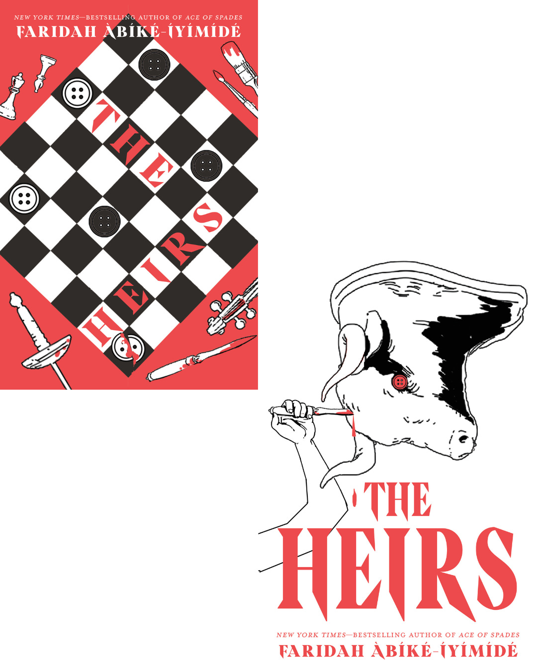
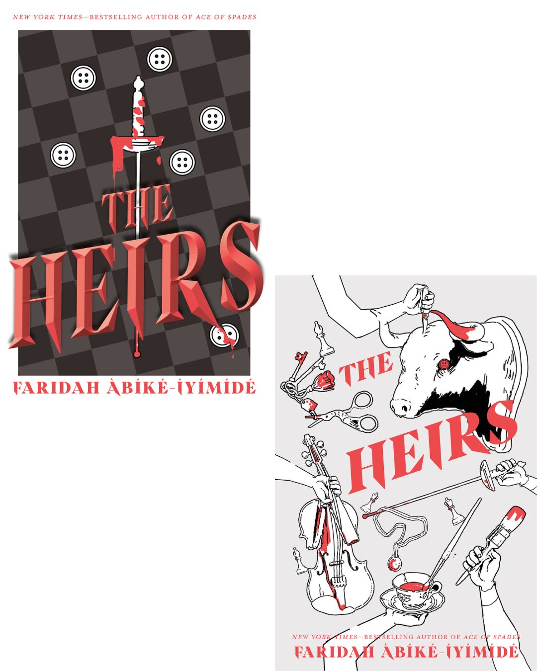
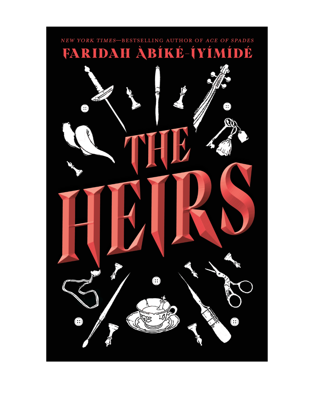
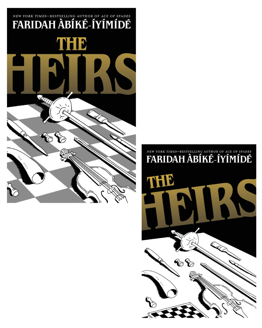
The second stage in the cover process involved another round of ten cover sketches and as you can see from the final image, it was in this round that we found the foundations for what would become our final cover!
The Final Cover
We went through so many iterations of that tenth sketch, such as different colour treatments and countless adjustments, before we landed on this wonderful final version!
There are so many things I love about this cover, from the way each piece represents a key moment, theme and/or character; the five buttons dispersed across the image which represent the Button siblings; as well as the beautiful colouring. Choo and Megan did such an incredible job, and as always, I feel extremely lucky to not only have such wonderful covers but to also work with a team that always invites me into these cover conversations.
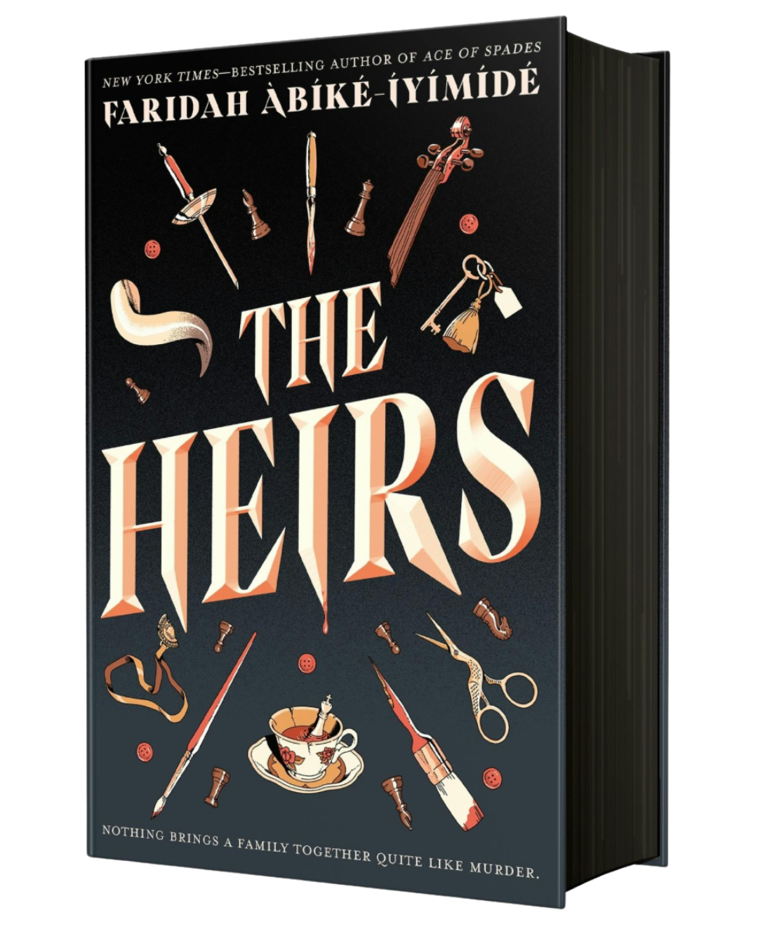
Even more exciting is the fact that the first printing of the U.S./Canadian edition of The Heirs will have this marvellous black sprayed edge.
I hope this post gave you some more insight about the book cover process!
The Heirs is available for pre-order, click here to get a copy! If you would like to know what The Heirs is about, here’s a little description below…
***
Five prodigies, one dead father, a mansion full of suspects…
Octavius the Maestro.
Fola the Brain.
Bilal the Olympian.
Perdita the Artist.
Romeo the Failure.
These are the five heirs of the illustrious billionaire Leontes Button. Adopted and viciously trained with their father’s infamous “Button Method” to prove his hypothesis for creating prodigies―child geniuses―the Button siblings have had no choice but to be brilliant according to their father's impossibly high standards.
Until he is murdered at his annual Prodigy Ball.
Now, all who attended the ball are required to stay in the Button Manor while the police investigate. But the officers have their work cut out for them―each of the Button siblings has something to hide, but The Heirs aren't the only ones with secrets. After all, Leontes Button was especially good at making enemies. . .
I’m actually so excited for this book it’s crazy. The cover is so so cool, too!
I love this! It’s so interesting to hear about the process🖤🖤